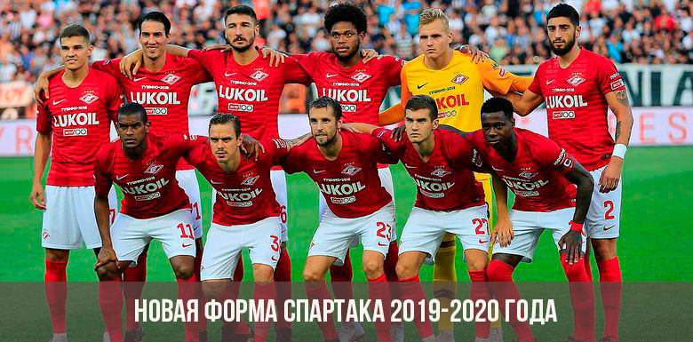
The form of the cult football club "Spartak" from the very beginning is almost always performed in red and white colors. Today, this color combination has already turned into a common noun: when they talk about “red and white”, football fans know that we are talking about the players in Moscow “Spartak”. In the 2019-2020 season, designers will present a new vision of the team's equipment, given the traditional symbolism.
Home kit
Several sports journalists have published a supposedly new Spartak form for the 2019-2020 season on social networks. The preliminary design of the home T-shirt appeared on the network in February 2019 and caused a lot of controversy among fans. However, there was no official confirmation from the management of the team.
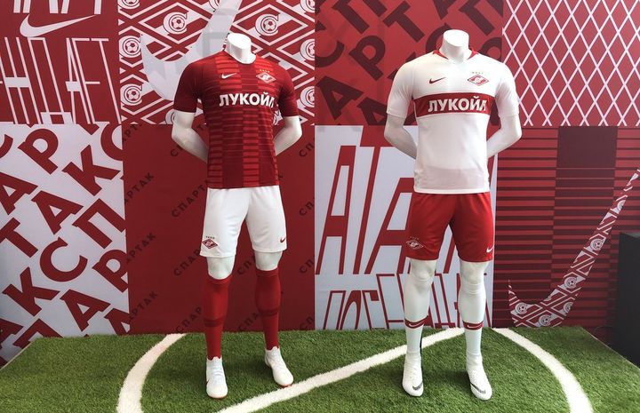
Based on the publication, the new Spartak uniform for the 2019-2020 season will be traditionally red with white elements. A wide white stripe will appear on the T-shirt again - a distinguishing feature of the Spartak team, which has not been used for two seasons.
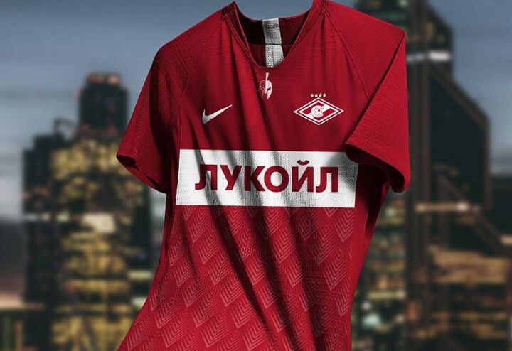
The name of the title sponsor who has long supported the team, the large oil company Lukoil, is printed in white letters on a white strip. This caused a dissonance among Internet users. In the comments, they expressed their dissatisfaction with the fact that at the first glance at a T-shirt, the name of the corporation, and not the symbolism of the club, immediately catches your eye. However, in recent years, this trend is considered normal among many large football teams, not only domestic but also foreign. The name of the main sponsor is often printed in large print on the chest of players, and the logo of the club itself is on the left, closer to the heart.
On the Spartak T-shirt, the logo is depicted in the upper left. In the new version, the symbolic rhombus is made in white, contrasting well with the main red background. A wide band crosses the rhombus inside, and in its center is the letter “C” with the ball in the middle. Four title stars adorn the rhombus.
On the right side of the T-shirt is the emblem of Nike, a company specializing in sportswear and shoes. For several years, the company's designers have been developing the concept of all sets of uniforms for Moscow Spartak. In addition, Nike also sponsors the team.
Nike has been working with Spartak since 2005 (that is, almost 15 years). Prior to this, the development of equipment for the team for two years engaged in the company Umbro. And from 1976 to 2002 (except 1988-1989), FC collaborated with Adidas.
An interesting solution was used to design the collar of a T-shirt: it has a curved parabolic shape, and an image of a gladiator's helmet is placed below. After all, the club is named after the famous gladiator Spartak, whose name has become a symbol of courage and courage.
At the bottom of the t-shirt, an ornament in the form of loops is used. The use of such prints is often found in equipment designs of various clubs. In general, the home T-shirt is made rather concisely, without unnecessary details. The new guest form Spartak has not yet been presented to the general public.
Previous equipment options
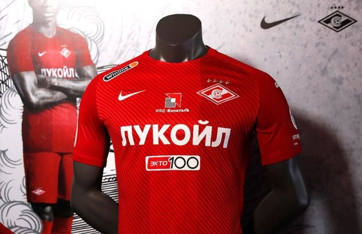
In the 2018-2019 season, the ammunition of the players was also performed in traditional colors: a red background and white details (the name of the title sponsor, the Nike logo and the club). However, the white stripe was not used in the design of home equipment, which caused discontent among loyal fans. The fabric of the t-shirt was marked with stripes that intersected its entire front.Also, the front part was divided into wide stripes made in different shades of red.
Guest equipment season 18/19 can be called a negative home. She names the main white color, and the elements, on the contrary, are red. The difference was the presence of a wide strip on the chest of the T-shirt - the Spartak brand name, which was made in red. The gate had a deeper neckline and red edging.
The shape of the 18/19 season was perceived by the fans better than the equipment in the 17/18 season. This was the first year in a long period of time when the traditional strip was removed from the main design (both from the home and from the guest suite). In addition, the form was full of a large number of names of various sponsors, which caused a wave of irony among the fans of the club. This form option could not be called the most successful, however, it was approved for matches of that period.
In the Russian football championship in the 17/18 season, FC Spartak took third place.
Read also:
 (No ratings yet)